Graphic Elements
Bringing a new dimension to our Catalyst
SAIT’s Catalyst symbol is forged from five S-shaped connectors, representing the people and relationships that define who we are. Inspired by this distinctive form, our new graphic elements — Catalyst currents and overlays — bring that same spirit to life across our visuals.
These graphic elements are designed to infuse our visuals with energy, motion, and bold personality. Used thoughtfully, they add vibrancy and depth to our layouts while supporting clear communication and consistent brand expression.
Currents
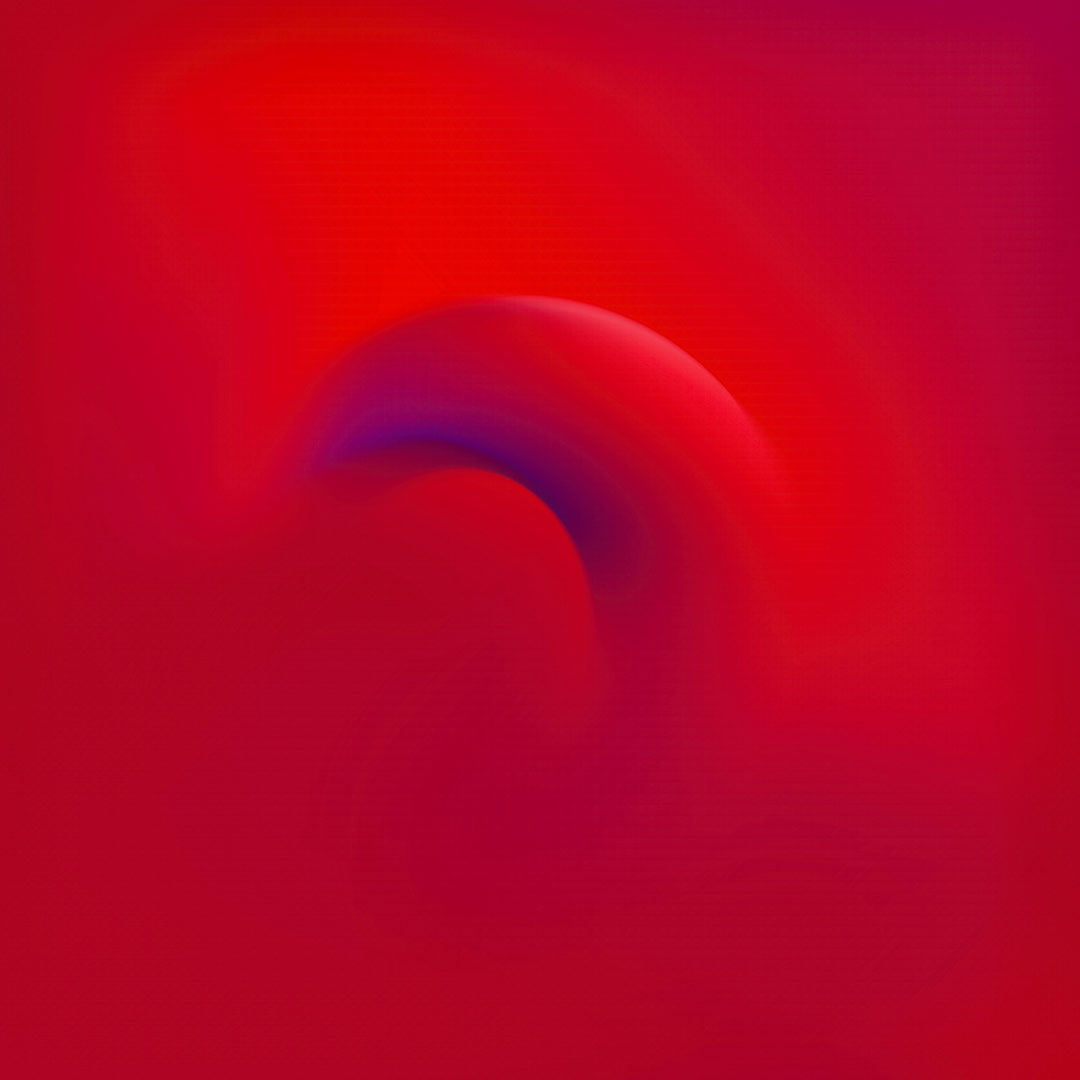
Catalyst currents, otherwise known simply as currents, add a new dimension to our visuals. These wispy elements are a bold expression of our brand’s energy and forward momentum, helping to convey motion and confidence. They enhance our visuals by adding passion and depth.
Whether layered with imagery or standing on their own, they bring a sense of purpose and positivity to any composition.
Currents are available in a range of brand colours, including red, blue, and purple. These elements can be cropped and scaled to create visually engaging backgrounds that adapt to various design needs.


Using our Currents
Catalyst currents can adapt to a variety of uses. By zooming in, you can achieve different colour gradients and textures.

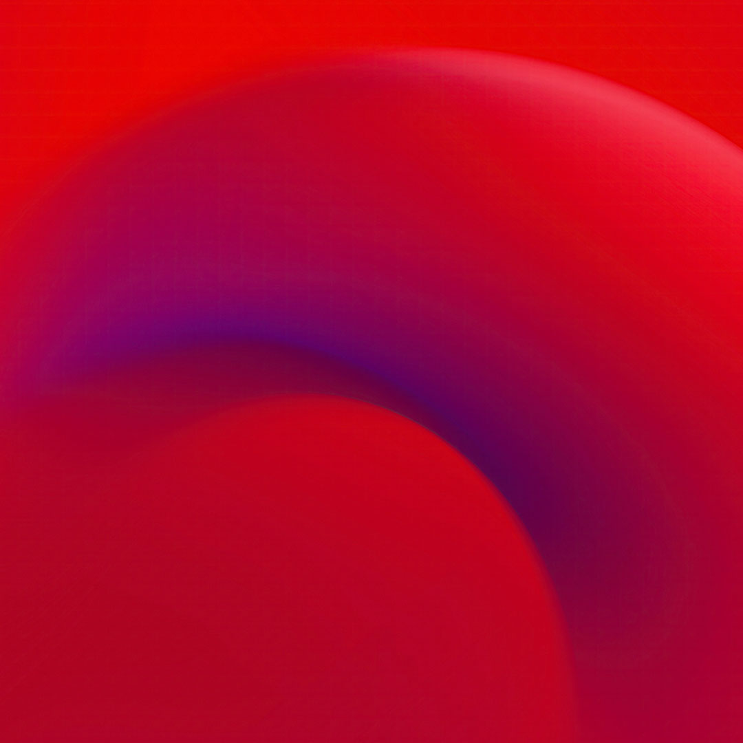


By cropping and rotating the Currents, you can create a wide variety of on-brand background options — ranging from bold, prominent strokes to more subtle textures.


Overlays
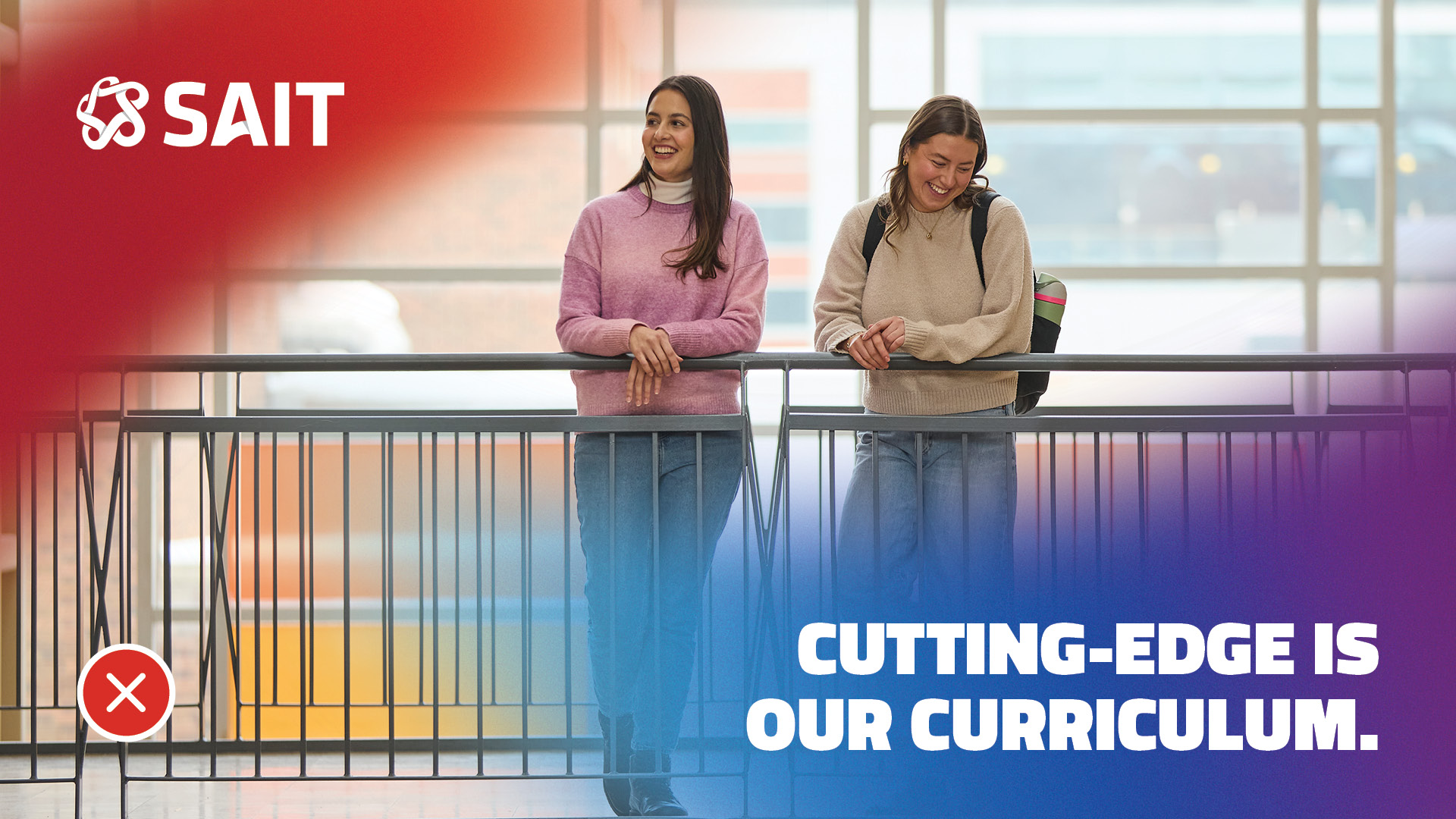
In addition to the Catalyst current backgrounds, a collection of overlays can be used to bring vibrancy, energy, boldness and ownership to a layout. When used over photography, they can help simplify complex visuals and can create quiet space for text readability. We have a library of overlays, all available in our signature brand colours.

Overlays are anchored to any edge of the page and placed over images or a white background. They can be enlarged and rotated as needed, always keeping their proportions.


Principles - Currents and overlays
Through the use of Currents and overlays, we want to elevate our colours and bring a new dimension to our brand. Please use the principles below to ensure that you are using these graphic elements correctly, and of course, when in doubt, just ask the experts!
Email [email protected] to find answers to your questions.


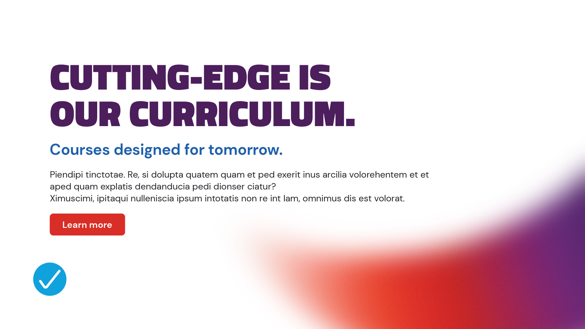


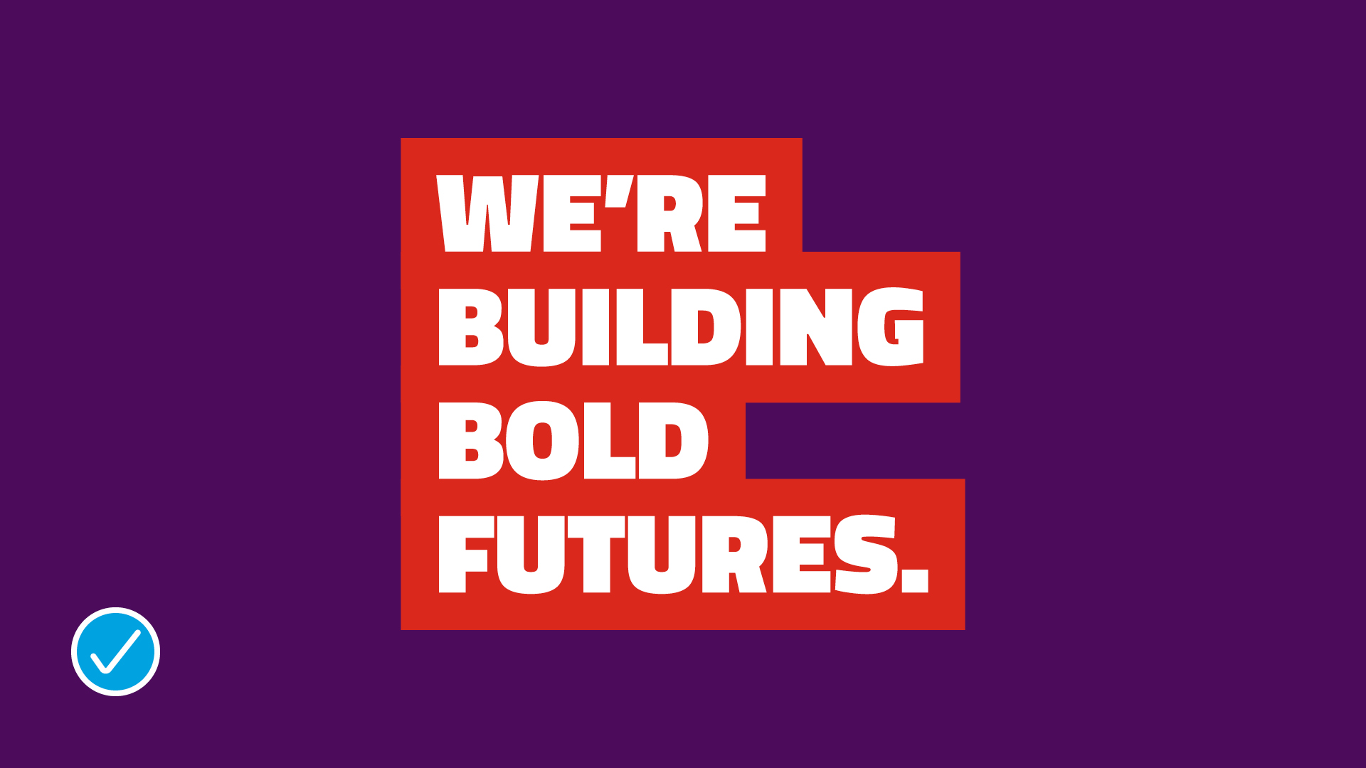
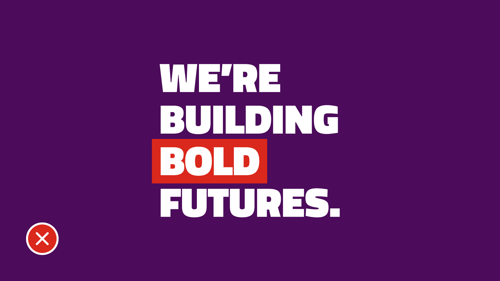
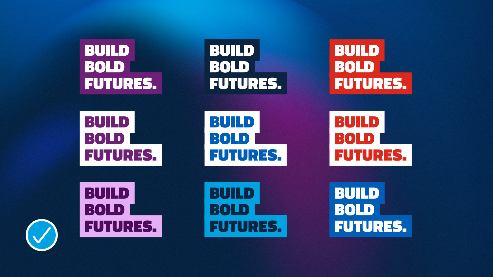
Text highlights
Add energy and clarity to your designs with the text highlight graphic treatment. Perfect for grabbing attention, this simple yet bold element enhances the readability of headlines while bringing a distinctive SAIT flair to your piece.
Use the text highlight element exclusively with Titillium Web, black weight font. Whether you're layering it with overlays, pairing it with currents, or letting it stand alone, the key is balance — choose colour combinations that complement each other and maintain strong visual harmony.
To keep things consistent across all materials, be sure to follow the usage guidelines.


Icons and illustrations
Utility icons
Utility icons are all about function. Clean, practical, and purpose-driven, they’re designed to communicate quickly and clearly — even at the smallest sizes. Keeping them simple and minimal helps maintain clarity and ensures they remain easily recognizable no matter the scale.
Stripping away unnecessary details improves legibility, supports consistency, and enhances usability. Select line icons over fill icons and make sure they are all consistent in weight and look across your material.
Download streamline icons![]()
Illustrations
To maintain a strong, authentic SAIT brand, avoid using illustrations in any branded materials. They often lack the consistency and distinctiveness needed to represent our identity effectively.
SAIT’s visual identity is grounded in authenticity. Use photography that features real people and real moments to tell stories, convey ideas, and spark emotion. If photography isn’t an option, rely on clean typography and brand elements like currents, overlays, or text highlights to create visual interest. These simple, recognizable graphics are uniquely SAIT — and they speak louder than stock illustrations ever could.

Questions?
Send us an email: [email protected].

Oki, Âba wathtech, Danit'ada, Tawnshi, Hello.
SAIT is located on the traditional territories of the Niitsitapi (Blackfoot) and the people of Treaty 7 which includes the Siksika, the Piikani, the Kainai, the Tsuut’ina and the Îyârhe Nakoda of Bearspaw, Chiniki and Goodstoney.
We are situated in an area the Blackfoot tribes traditionally called Moh’kinsstis, where the Bow River meets the Elbow River. We now call it the city of Calgary, which is also home to the Métis Nation of Alberta.